The Advanced Graphs page displays detailed system information. Go to the System > Advanced Graphs page. Click on a section heading to view historical data.
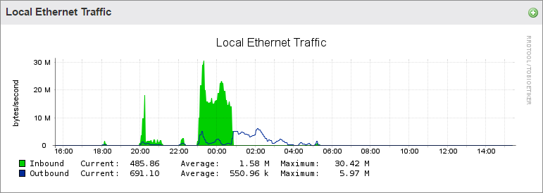
Local Ethernet Traffic
The Local Ethernet Traffic graph presents inbound and outbound network traffic for the selected Barracuda Backup appliance:
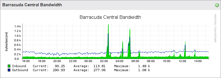
Barracuda Central Bandwidth
The Barracuda Central Bandwidth graph represents the bandwidth utilization from the Barracuda Backup appliance to the Barracuda Networks Cloud Servers:
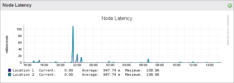
Node Latency
The Node Latency graph represents the latency between the Barracuda Backup appliance and the cloud node:
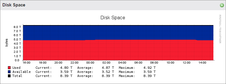
Disk Space
The Disk Space graph provides a detailed account of the amount of disk space that has been used on the Barracuda Backup appliance, as well as the remaining available disk space:
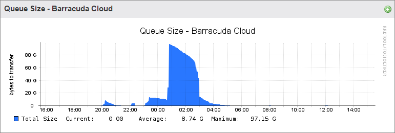
Queue Size
The Queue Size - Barracuda Cloud graph presents a graphical history of the amount of data replicated over time from the Barracuda Backup appliance to the Barracuda Cloud:
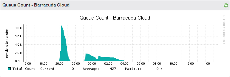
Queue Count
The Queue Count - Barracuda Cloud graph represents the number of parts replicated over time:
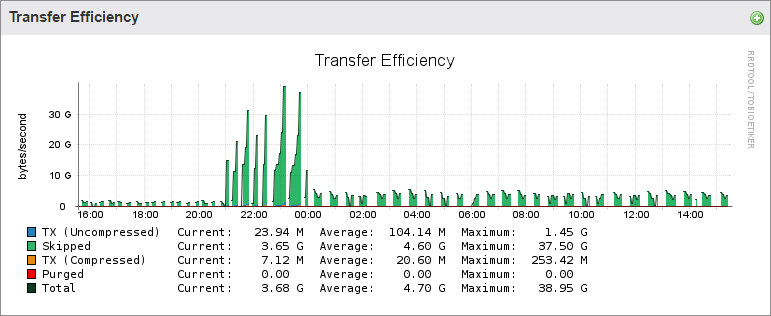
Transfer Efficiency
The Transfer Efficiency graph provides a detailed look at data replication from the Barracuda Backup appliance to the replication target (Barracuda Cloud or another Barracuda Backup appliance). In the graph below, the green shaded area represents the Skipped or deduplicated data. The blue, TX (Uncompressed), represents the actual data being transferred and the amount of bandwidth that would be used if compression was not utilized. The orange, TX (Compressed), represents the actual bandwidth utilized, after compression, to send data offsite. The red Purged amount refers to data removed from the offsite transfer queue that has already been purged locally:
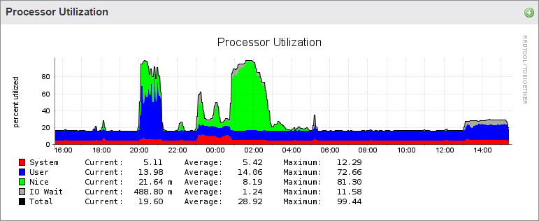
Processor Utilization
The processor utilization graph represents the following:
- System – Percentage of CPU utilization that occurred while executing at the system level (kernel).
- User – Percentage of CPU utilization that occurred while executing at the user level (application).
- Nice – Percentage of CPU utilization that occurred while executing at the user level with nice priority.
- IO Wait – Percentage of time that the CPU or CPUs were idle during which the system had an outstanding disk I/O request.
- Idle – Percentage of time that the CPU or CPUs were idle and the system did not have an outstanding disk I/O request.
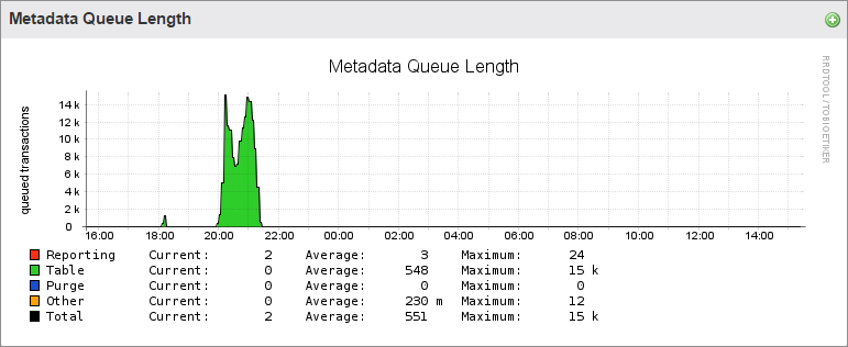
Metadata Queue Length
The Metadata Queue Length graph provides a graphical representation of the reporting and statistics data transfer over time:
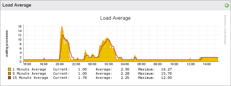
Load Average
The Load Average graph details the history of running processes over time: