

The Email Security page displays two graphs that give you important information about email threat levels at a glance. You can quickly view threat level results on these two graphs:
Analysis Results
Analysis Results by Date
The Analysis Results Grap
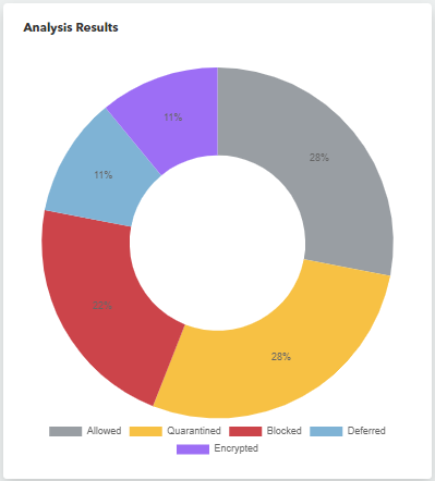
A graph shows the proportion of email threats of each threat level. You can click any section of this chart to create a quick filter.
To see the percentage of emails with a certain threat level
In Barracuda XDR Dashboard, click Intelligence > Email Security.
In the Analysis Results graph, hover your cursor over one of the threat levels:
Neutral
Caution
Danger
Analysis Results by Date Graph
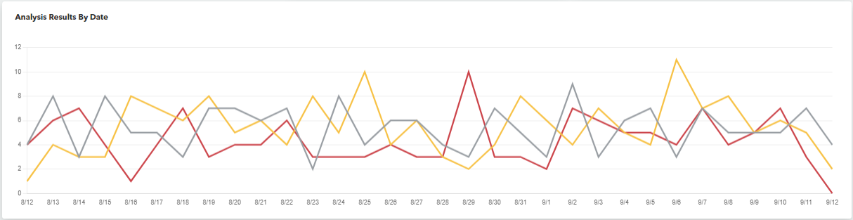
A line graph that shows the number of emails with each threat level that were received per day/hour.
The Analysis Results by Date graph changes if the page is filtered by date.